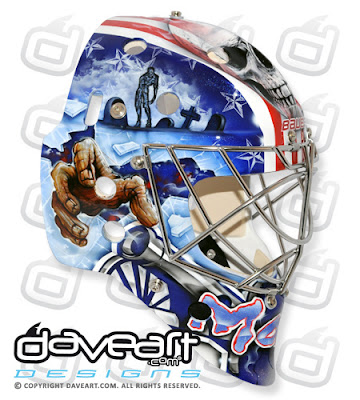
Artist: David Gunnarsson
In March Mason debuted a new mask featuring zombies. Here's what Dave had to say about it:
"Steve Mason of the Columbus Blue Jackets told me he wanted something really, really scary, created in a new way... At that time I was watching a zombie movie when I painted, yes, I always watch movies when I paint... :-)
Zombies are so scary and creepy, so I came up with a very scary design theme with zombies, but in a new style, mixed with American theme and also Blue Jackets colors and graphics."
http://www.daveart.com/mask-gallery/set/72157627725332568/default.aspx
So on the left side an artwork with the theme of horror of war. Scary civil war skull soldiers give the design it's name ”SkullSoldiers”. As you can see I'm also inspired by horror movies and scary cartoons, and this is also a tribute to that.
The other side is a logo themed design, looks sharp from a distance, and when you come close you discover a new dimension of details. The side is painted like it is stitched, in a scary way. When you come even closer you will see that all areas are painted with dramatic lines to add even more scary and disturbing feelings.
From The Goalie Guild
Mason started wearing new pads near the end of October.
Mason's 3rd jersey mask and pads.
Mason debuted another set of pads in late December.


Mason debuted some new pads against the Flames on 12/28/2011 - James
ReplyDeleteActually he wore them against Chicago on the 27th as well. You can find them at http://bluejackets.nhl.com/club/gallery.htm?id=26364&navid=DL|CBJ|home and http://bluejackets.nhl.com/club/gallery.htm?id=26332&location=/photos&pg=1
ReplyDeleteWow, I can't keep up with Mason and his pads!! ;o) Thanks for the heads up, guys!! I've added a couple photos. I'll see if The Goalie Guild gets a template up for these new pads as well.
ReplyDelete